Nov 13, 2024

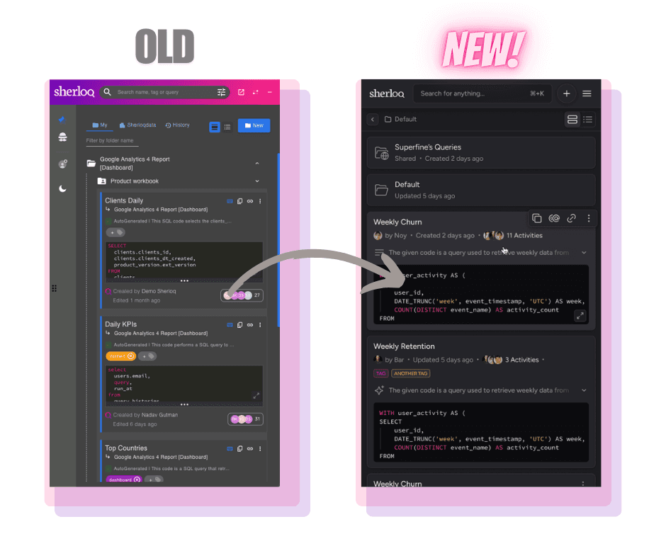
We’ve just launched a major redesign of Sherloq! ✨
We've changed pretty much everything, it's a redesign of our product, UI/UX, website, user flows and more…
First - why did we do this?
Well, we’ve been listening carefully to all the feedback you’ve shared with us – and the biggest takeaway was that Sherloq needed to be faster, smoother, and easier to use. You told us it was feeling sluggish, too rigid, and even buggy at times. We heard you, loud and clear.
That’s why we’ve completely changed the experience, focusing on performance, simplicity, and beauty.
We wanted Sherloq to not only be a tool you rely on but one you actually enjoy using. Our goal is to make your day-to-day work easier, faster, and yes, even a little more fun.
Out with the old, in with the new.
So here’s what’s new:
UI: Well…. basically everything :)
Performance, performance, performance - this was the most important thing for us. Your experience should feel flawless. So no more waiting for a query to be created, no more loading between different pages of the product, no more waiting dozens of seconds to simply delete a folder.
Queries are much clearer -
We understood what’s important to show in preview mode and what isn’t (which we then added to the query profile).
The query profile has no-load and easily appears as it pops-up from the bottom of your screen.
Folders are finally much more organized -
We switched the folder view to be more like any storage app (Google Drive, Notion etc). That means no more one long page of queries in subfolders in folders. Rather we give each folder the respect it deserves with a page of it’s own.
You can easily see which users each folder is shared with.
The search experience is easy-to-use -
Filters are now out in the open - did you know that that you had the ability to filter your search results based on the query date, person, source and more? Probably not, because it was hidden in some kind of (honestly weird) icon. Filters are now visible to all, and even better - you can understand your search results based on the options in each filter. Try it out and let us know what you think :)
Removing the clutter (we’re a plugin.. so anything on the screen needs to be chosen carefully) -
No more annoying left side panel - it’s now in a simple side menu
The history tab also moved to the side menu
Public section became a folder
And Vuola - you get much more room to emphasize and see the important stuff (like, let’s say, the folders and queries themselves).
Creating a new SQL became a whole lot easier with the very straightforward new ‘+’ button (when you think about it, how wasn’t this an option until now?…)
And more like: automatically generating a title (which is new) and a description (which isn’t) is now totally up to your choice, editing a query is in the query profile, bug fixes…
So many changes (and we’re sure that you’ll notice some more while using it), all in the hopes of making this product as simple and easy to use as possible.
Want to see more? Read our new Docs here.
---
A huge THANK YOU 💐 to everyone here that took the time to hop on calls with us, brainstorm, and validate ideas.
These insights helped shape this redesign, and we can’t thank you enough for being part of this journey with us.
I hope you love this new version as much as we do!
Let us know what you think – as always we’re eager to hear your thoughts and inputs.
Get Sherloq Free

